Can you imagine a public transport network map in which all lines are represented by the same color?
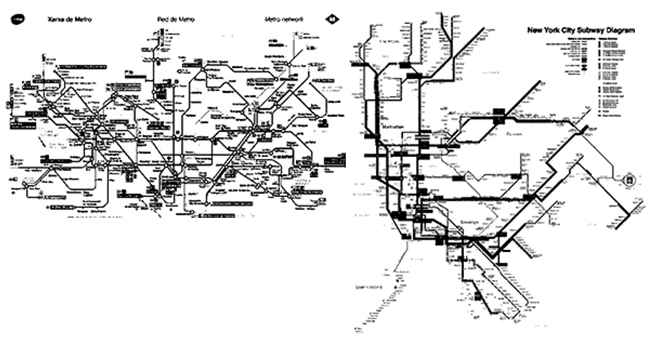
Images like the ones below probably don’t give you enough information to differentiate between the different public transport lines that serve the cities of Barcelona and New York.
With the development and growth of public transport in large cities in the early 20th century, rail and metro lines began to be differentiated by numbers or letters. The need to differentiate them on a map also emerged, allowing them to be correctly located in a completely uniform environment with no natural elements, such as the metro. This was when colors were introduced as a means of representation.
It was so successful that in many cases the original names of the lines were overshadowed and the colors were commonly used to refer to them.
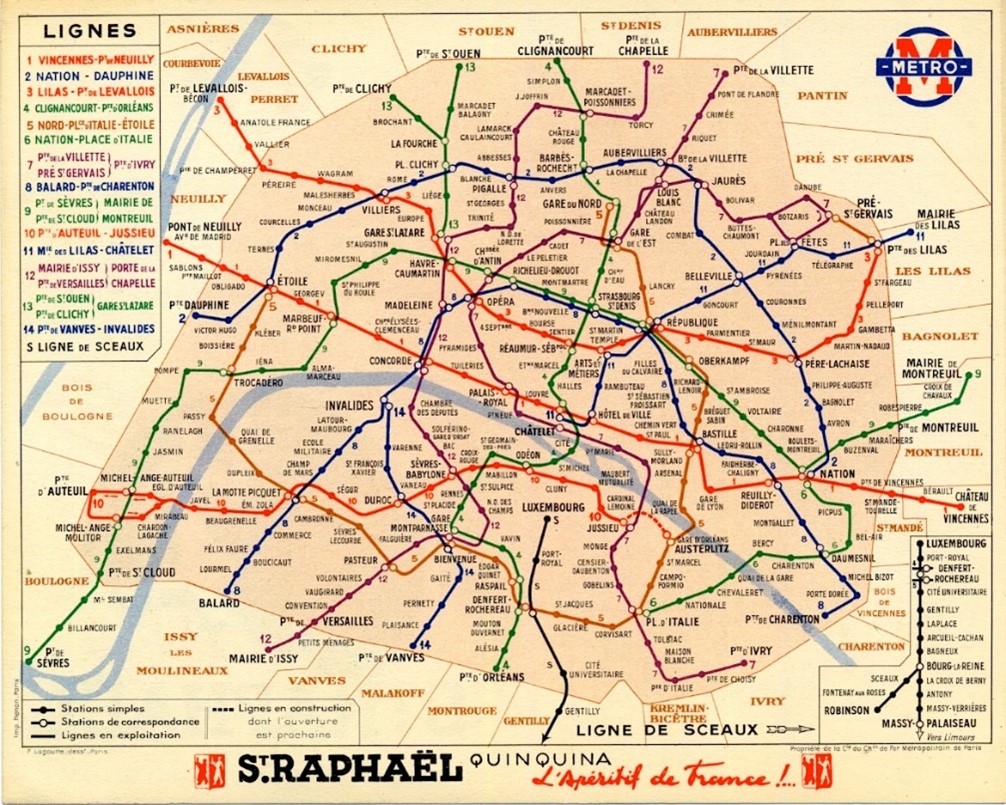
In the early days, the colors used to represent the lines were basic colors that contrasted strongly with each other. As the networks have grown, the color ranges of the transport lines have also grown, increasing their complexity, but always maintaining the objective of being representative and descriptive to avoid confusing the user.
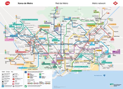
Color ranges for metro networks
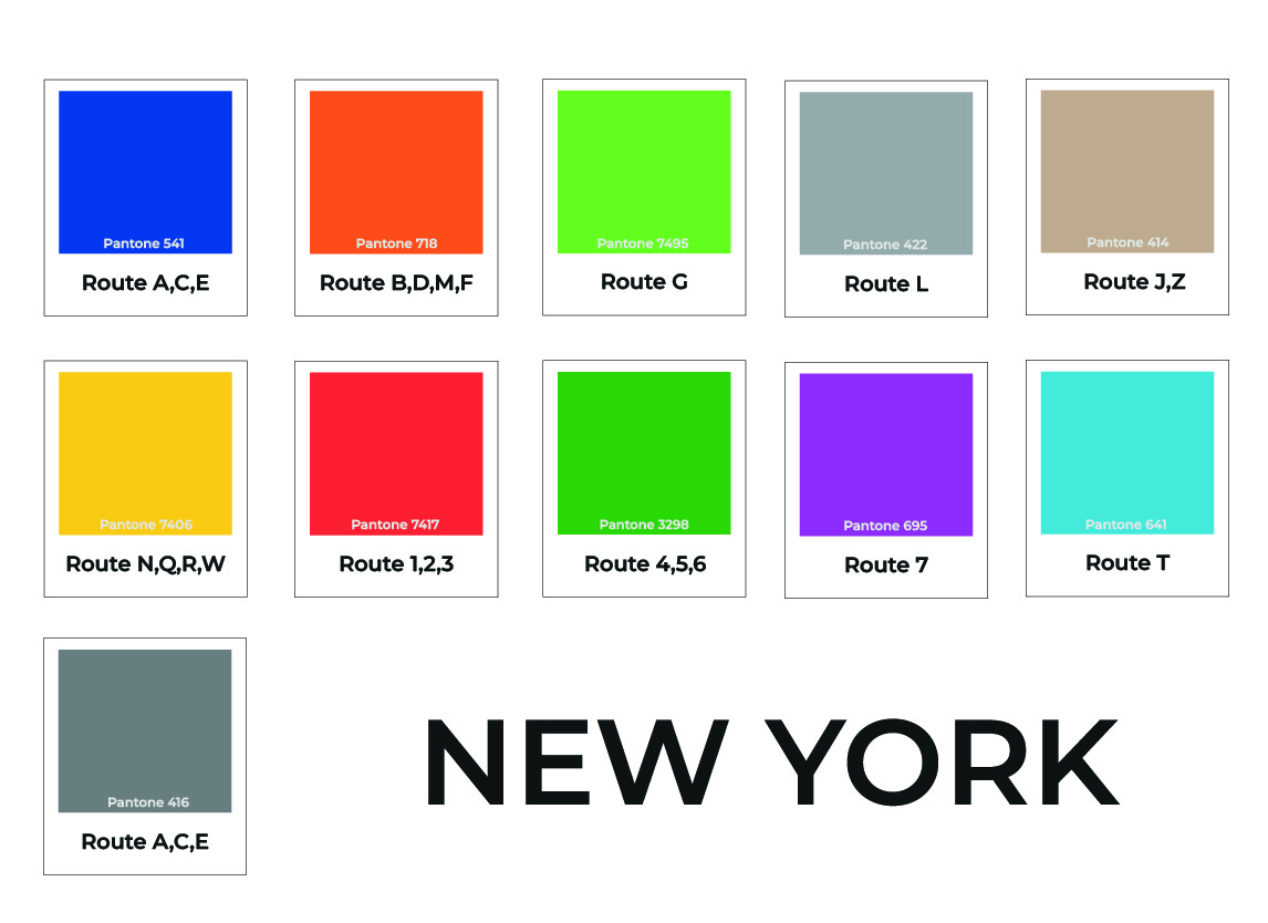
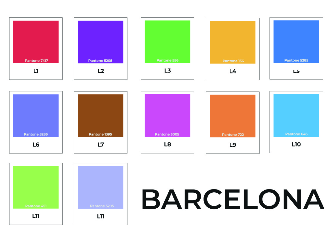
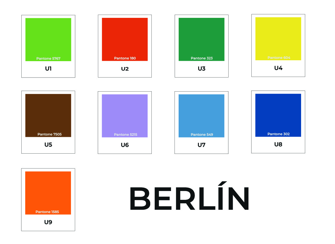
Here you can see three examples of the range of colors used by large cities to represent and label their public transport network. As you can see, all of them use similar tones.